
Cooperative Website Morocco: Why It Brings No Clients?

In This Article
- A website isn't a poster — it's a sales tool
- Mistake 1: A site with no clear call to action
- Mistake 2: Not being visible on Google (SEO)
- Mistake 3: A site that doesn't work well on phones
- Mistake 4: A site that's too slow to load
- Mistake 5: No follow-up after the site goes live
- Concrete example: From a simple poster to a real sales tool
- A simple checklist before investing more
- Fix it before investing more
- FAQ
A website for Moroccan cooperatives should be more than a simple online showcase. Every year, Moroccan cooperatives spend money building a website, assuming that simply having a site is enough to sell more. A few months later, the observation is often the same: the site exists, it gets shared on social media, but it brings in no calls, no orders and no new clients.
This isn’t inevitable. In most cases, this silence has a simple explanation. This article walks through the five most common mistakes that turn a cooperative’s website into a simple “digital poster” — and how to fix them before losing months of visibility and, often, real sales opportunities.
A website isn’t a poster — it’s a sales tool
The first mistake is a mistake of vision, before it’s a technical one. Many cooperatives treat their professional website as a simple formality — a place to say “we exist,” almost like putting up a poster online.
But a website that actually works behaves very differently: it’s like a salesperson working 24 hours a day. It has to convince an unknown visitor within a few seconds, answer their questions, and guide them toward a clear action — buy, ask for a price, or get in touch with the cooperative. Without this logic built in from the start, even the most beautiful design will sell nothing.
This difference is exactly what separates websites that “sleep” from websites that genuinely bring money into the cooperative. The five mistakes below almost all come from the same starting point: building a site so that it exists, rather than building it so that it sells.
Mistake 1: a site with no clear call to action
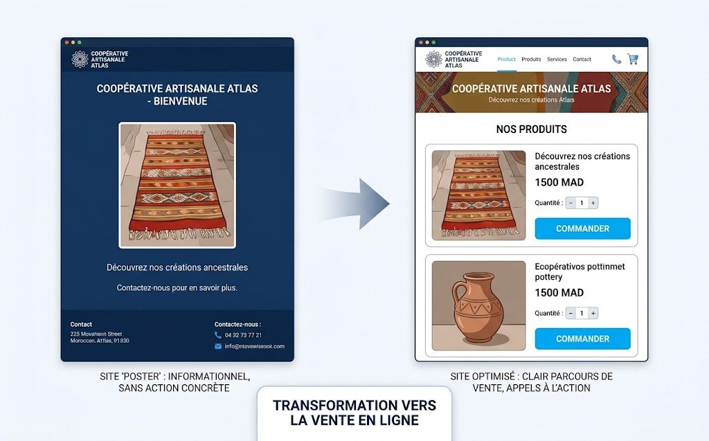
A site that shows off the cooperative’s products without ever clearly saying what to do next is a site that loses clients on every single visit. The visitor arrives, looks around, hesitates, and leaves — because nothing told them what to do.
Illustrative example: imagine a rug cooperative in Meknes whose site shows beautiful photos of its rugs, but with no visible “Order” or “Request a price” button anywhere near the top. The interested visitor has to scroll all the way down to find a phone number buried in the footer. Most give up before they get there.
Every important page on the site has to answer one simple question for the visitor: what should I do right now? Order, call, request a price, visit the point of sale — this button needs to be visible, repeated, and easy to understand on every page that matters.
A useful way to check this is to imagine a complete stranger landing on the page with no context at all. Can that person, within five seconds, tell what the cooperative sells and what they’re supposed to click? If the answer isn’t an immediate yes, the call to action needs to be made bigger, clearer, or simply added where it’s missing. This applies just as much to the homepage as it does to every individual product page — a visitor who lands directly on a product through a Google search or a shared link should see the same clear next step as someone who starts from the homepage.
Mistake 2: not being visible on Google (SEO)
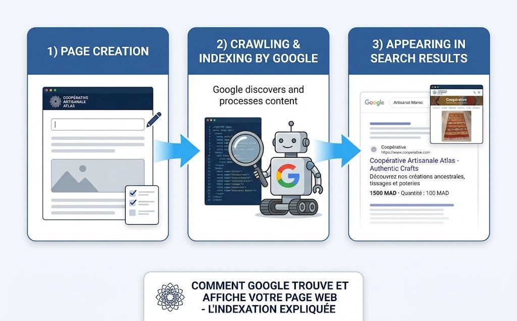
A beautiful website that’s invisible on Google is like a shop with no sign, tucked away on a street nobody walks down. This is one of the most costly mistakes, because it’s invisible to the cooperative itself: everything seems to be working, except that nobody ever finds the site in the first place.
Search engine optimization — SEO — doesn’t just mean “adding keywords.” It means properly organizing the site, making it load quickly, writing content that answers the real searches people make in Morocco, and making it easy for Google to understand what each page is actually about.
The trap of a “site that was built but never properly indexed”
A frequent case: a site delivered by a provider, nice to look at, but never properly submitted to Google Search Console, with no organized titles, photos with no description, and no chosen keywords. The result: the site has existed for months, but it never shows up for any search that would actually be useful. It’s a bit like opening a shop and never telling anyone its address.
This mistake is particularly frustrating because it often goes unnoticed for a long time. The cooperative sees that the site is online, assumes the job is done, and moves on to other priorities. Meanwhile, every month that passes without proper SEO foundations is a month of potential searches — “argan oil cooperative morocco,” “handmade rug meknes,” or similar — going entirely to competitors who did take the time to get this right. Fixing it later is always possible, but it costs more time than getting it right from the start, because search engines need time to re-crawl and re-evaluate a site after changes are made.
Mistake 3: a site that doesn’t work well on phones
In Morocco, most visitors browse the internet from their phone. A site designed and tested only on a computer, with no real check on a smartphone, therefore excludes a large share of potential visitors before they even get a chance to buy anything.
The typical signs of a site poorly adapted to mobile: text too small to read comfortably, buttons too hard to tap accurately with a finger, a menu that doesn’t open properly, a contact form that’s painful to fill in on a small screen.
Every little detail like this pushes the visitor to close the page within a few seconds, often without even consciously thinking about it — they just feel that “this is annoying” and move on to the next result on Google.
Google itself gives priority to sites that work well on mobile. A site poorly adapted to smartphones will also rank lower, even for searches made from a computer, because Google primarily evaluates the mobile version of a site when deciding where to place it in results.
For a cooperative, this mistake is particularly easy to miss, because the people managing the site often check it from a desktop computer at the office, where everything looks fine.
The only reliable way to catch this problem is to actually open the site on a phone, under normal conditions — on a standard mobile connection, not office Wi-Fi — and go through the full buying journey as a real visitor would: finding a product, reading its description, and trying to place an order or send a message.
Mistake 4: a site that’s too slow to load
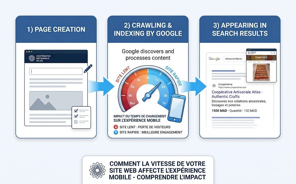
A visitor’s patience online is measured in seconds. Past a certain waiting time, most visitors leave the page before it has even finished displaying — and they rarely come back to try again.
Illustrative example: an argan oil cooperative near Essaouira notices that many mobile visitors leave the product page very quickly. Looking at the site’s photos, it turns out they were never resized: each photo weighs several megabytes, which strongly slows down loading on a normal mobile connection. Simply reducing the file size of these photos can meaningfully fix this problem.
The most common causes of slowness are usually simple to fix: photos that are too heavy, poor-quality hosting, too many unnecessary scripts running in the background, or no caching set up at all. A technical audit generally makes it possible to quickly find these bottlenecks and prioritize the fixes that will make the biggest difference.
It’s worth noting that loading speed isn’t just a matter of visitor comfort — it directly affects sales. A visitor who is ready to buy but has to wait several seconds for a page to load is a visitor who may simply close the tab and search for a similar product elsewhere. In this sense, a slow site doesn’t just lose visibility on Google; it actively loses sales that were almost already made.
Mistake 5: no follow-up after the site goes live
The last mistake — probably the most underestimated one — is believing that launching the site is the end of the work, when in reality it’s only the beginning. A site that’s “built and then forgotten” loses value over time: the content ages, competitors move forward, and Google’s rules change regularly.
Without regular follow-up — traffic statistics, content updates, small technical adjustments — it becomes impossible to know what’s working and what isn’t. It’s a bit like running a Facebook ad campaign and never once looking at the results: money gets spent, but nothing gets learned from it.
A simple monthly habit is enough to avoid this trap: checking how many visitors came to the site, which pages they looked at, where they came from, and whether contact requests increased or decreased compared to the previous month. This doesn’t require advanced technical skills — free tools exist precisely for this — but it does require making it a regular habit rather than a one-time check done right after launch and then forgotten.
Concrete example: from a simple poster to a real sales tool
Let’s take the case of a women’s rug-weaving cooperative in Meknes. Its site, online for two years, showed a nice product catalog but received less than one contact request per month. An audit revealed the five mistakes described in this article: no visible order button, a loading time of more than six seconds on mobile, no SEO organization at all, and no tracking of visits since the site was created.
After fixing these issues — clear calls to action on every product, lighter photos, properly organized titles for local searches, and monthly tracking of statistics — contact requests went from less than one per month to several per week, with no additional advertising spend. The difference didn’t come from a new design. It came from methodically correcting these five specific points, one at a time.
A simple checklist before investing more
Before spending more money on advertising, a new design, or a complete rebuild, it’s worth taking fifteen minutes to check the five points covered in this article, one by one, as if seeing the site for the first time.
Open the homepage on a phone, on a normal mobile connection, not office Wi-Fi. Is there a clear button telling the visitor what to do? Does the page load within a couple of seconds, or does it feel sluggish? Try searching on Google for the cooperative’s name, and separately for the type of product it sells combined with a city or region — does the site actually show up, and on which page of results? Finally, check whether anyone has looked at the site’s visit statistics in the last month, and whether any piece of content has been updated recently.
These four quick checks won’t replace a full technical audit, but they’re usually enough to reveal, within a few minutes, which of the five mistakes is most likely holding the site back. A cooperative that finds a clear answer to each of these questions already has, in most cases, a site that’s close to converting visitors into real clients — while a cooperative that struggles to answer even one of them has found exactly where to start.
It’s also worth remembering that these five mistakes rarely come alone. A site with no clear call to action is often also a site that nobody has checked on mobile, because both problems come from the same root cause: the site was built and then left untouched. This is precisely why working through the checklist in order, rather than jumping straight to the point that seems most urgent, tends to produce better results — fixing the call-to-action problem while the site is still slow on mobile, for instance, will only partly solve the underlying issue.
Is your cooperative’s website facing these same problems?
A audit can identify, within minutes, what’s stopping your site from turning visitors into clients.
fix it before investing more
A website that brings in no clients is almost never a design problem. In most cases, it’s a combination of these five mistakes: no clear call to action, neglected SEO, a poor mobile experience, technical slowness, and no follow-up after launch.
The good news is that each of these mistakes is easy to identify and fix, often without rebuilding the entire site. The first step is simply knowing precisely where the blockages are — which is exactly what an audit of the current site makes possible, before considering any new advertising spend or a full redesign.
FAQ
Website for a cooperative in Morocco
How much does it cost to build a website for a cooperative in Morocco?
The cost mainly depends on the complexity of the project: a simple showcase site presenting the products, or an e-commerce site with a catalog and online payment, don’t have the same budget. What matters is seeing the site as an investment meant to sell, not just an expense, and including SEO and mobile adaptation in the quote from the very start.
How long does it take to build a cooperative's website?
A well-organized showcase site can go live within a few weeks. The timeline is longer for an e-commerce site with online sales, because of the testing required before launch.
Is a free website enough for a cooperative?
A free website can work for testing an idea, but it often comes with serious limitations: weak SEO, little customization, and slow performance — three things that are essential for turning visitors into clients. For a serious activity, a professional website remains clearly preferable.
Does a cooperative need an e-commerce site or a simple showcase site?
It depends on how the cooperative sells its products. A showcase site is enough if sales mostly happen through direct contact (phone, visit, market). An e-commerce site becomes useful as soon as the goal is to sell directly online, with payment and order management built in — also useful for reaching clients outside Morocco.The development of e-commerce in Morocco is also creating more opportunities for small businesses to reach customers beyond their immediate local market.
How can I tell if my cooperative's website has problems?
A technical and SEO audit makes it possible to objectively find the blockages: loading speed, title organization, how well the site works on mobile, presence on Google, and the buying journey. This is generally the first step before deciding on any redesign or new advertising spend.